Hong Kab Fang
Food & Restaurant
Brand Identity | Brand Tagline
Client's Product
A quick-service and self-service restaurant offering Thai-Chinese cuisine.
Target
1. Primary Target Audience
- Working-age men and women, aged 25–45
- New-generation families
- Customers with a middle-income level or higher
- Individuals who enjoy exploring unique and innovative food experiences
- Health-conscious consumers
2.Secondary Target Audience
- Tourists seeking to try new restaurants
- Tourists looking for gift or souvenir options


About Hong Kab Fang
Pain Point
1. The existing logo has elements that the brand feels are not yet cohesive, making it challenging to adapt and expand upon for brand development.
2. There is no robust brand book, resulting in incomplete or inconsistent brand application.
3. The brand requires a slogan or additional concepts that can align with and guide the mood and tone for store decoration.
4. The swan in the logo should be designed with the potential to evolve into a mascot in the future.
Client’s Needs
1. Rebranding the Brand Identity: This includes redesigning the logo, defining a cohesive color palette, and selecting harmonious font pairings to represent a Thai-Chinese quick-service and self-service restaurant.
2. Brand Tagline Design: Crafting a memorable and impactful tagline to effectively communicate the essence and uniqueness of the brand.
Design Concept
Replenishing our energy with rice and finding happiness in sharing a meal.
Brand Identity:
Designed to convey a sense of energy, speed, warmth, and approachability for the restaurant.
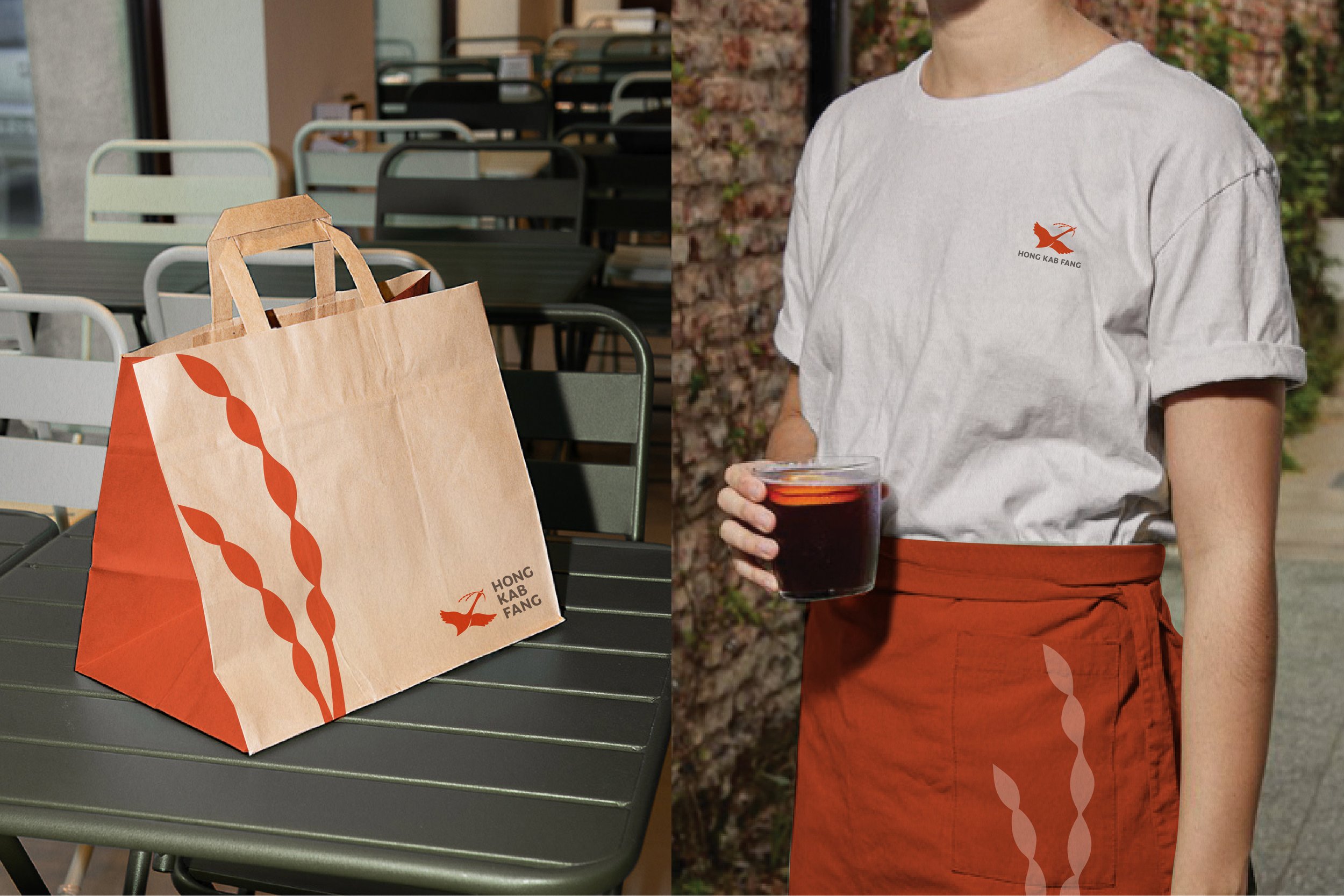
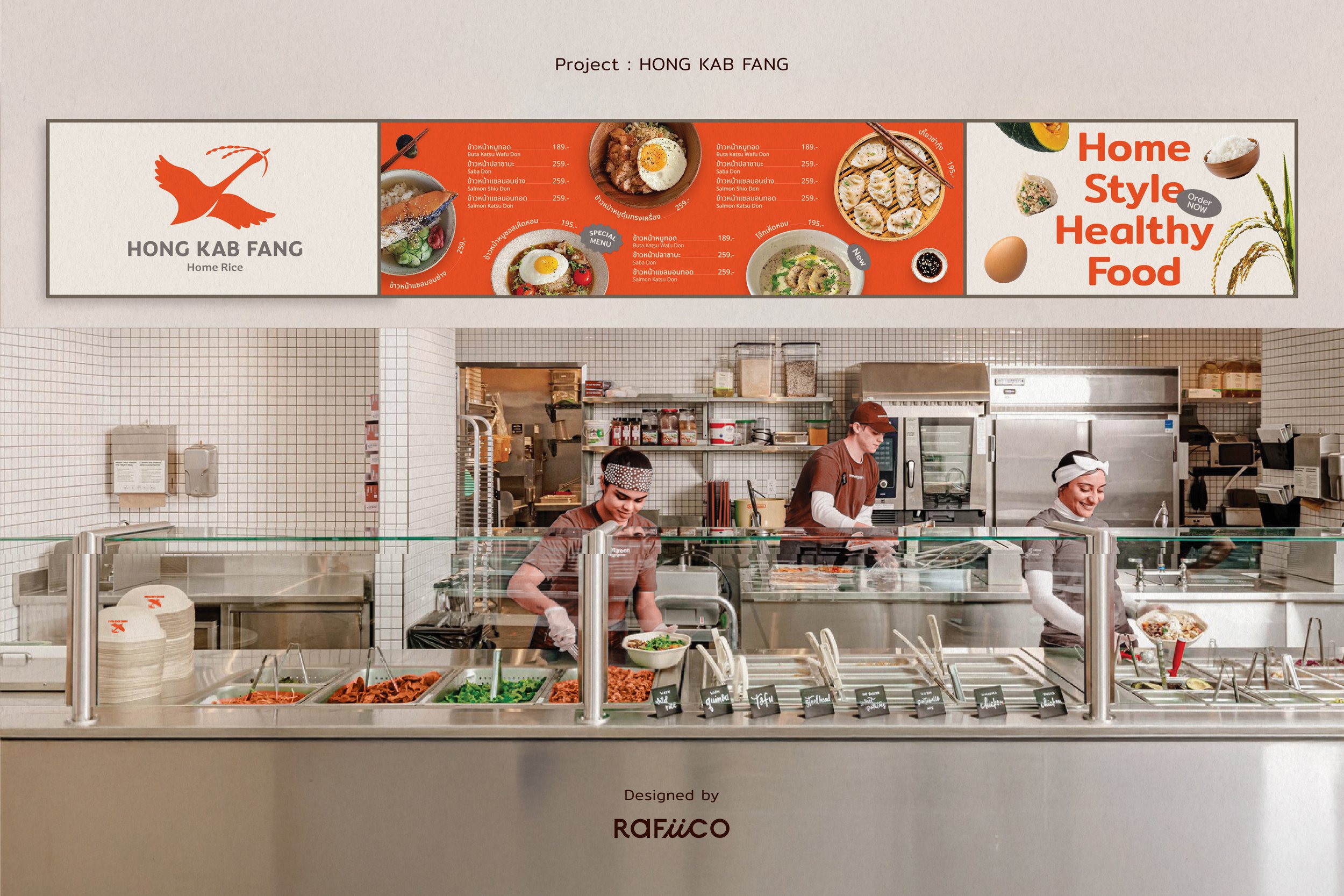
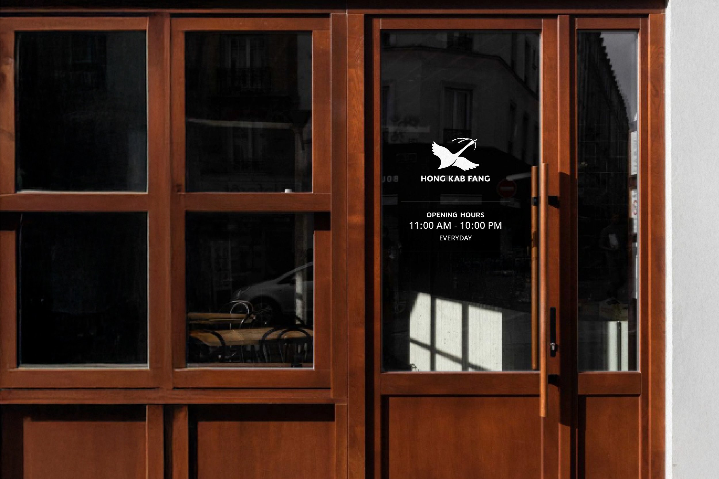
Logo: Developed from the brand's existing logo but adjusted to create a friendlier, more approachable, and modern look while retaining the Thai-Chinese essence.
Color Palette: Evolved from the brand's original orange tones, now made more vibrant to align with the quick-service & self-service restaurant vibe. Paired with warm tones for a visually comfortable yet strong appearance, ensuring versatility across various applications.
Brand Tagline:
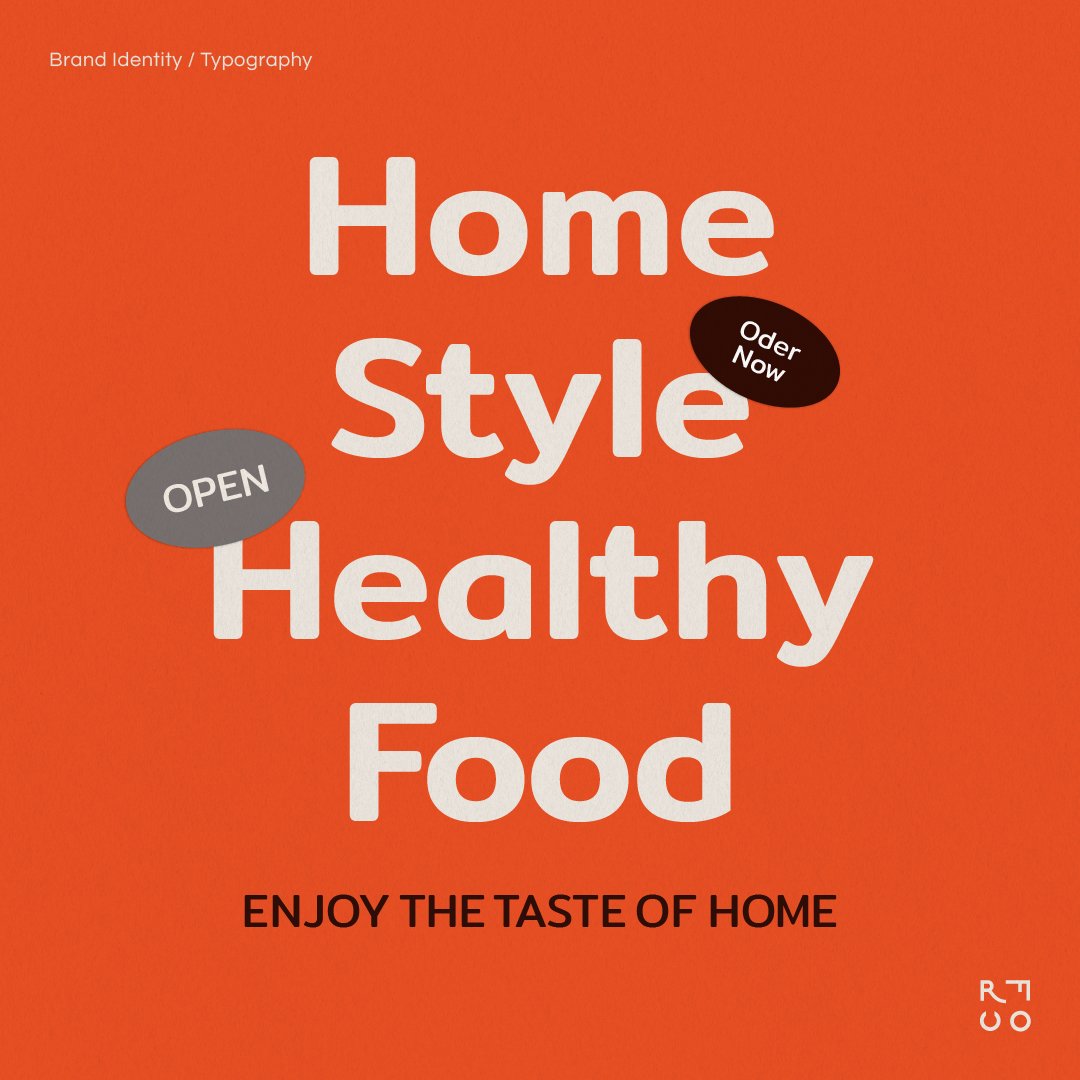
Crafted to reflect the brand's focus on care, warmth, and the sense of togetherness in family activities. The tagline is: "Family Comfort in Every Rice Bowl"
More Projects
Rafiico Design Solution
Rafiico Design Solution มีประสบการณ์ในการออกแบบแบรนด์และแพ็คเกจที่ได้รับการยอมรับจากลูกค้าในหลายธุรกิจ ความคิดสร้างสรรค์, ความเชี่ยวชาญ, และความตั้งใจในการทำงาน ตลอดจนความใส่ใจในดูแลและประสานงานกับลูกค้าทุกท่านเพื่อให้ผลงานออกแบบ ตอบโจทย์ตรงตามความต้องการของลูกค้ามากที่สุด


